KOE
BRAND IDENTITY, WEB/PRINT DESIGN
Knockout Events Co. is a mother-daughter owned events planning company based in Atlanta, GA. From birthday parties, to baby showers, to viewing parties - they can turn any budget into a "knockout". I'm currently partnered with Knockout as preferred designer, in addition to developing the visual brand.
COLOR PALETTE
SCOPE
Unlike other projects, Knockout was completely new with no identity at all. My client knew she wanted something fun, corporate and bright. We wanted to attract people who throw large social gatherings, regardless of gender. Though capable of coordinating virtually any event, my client knew she wanted to appeal to family centered gatherings (baby/wedding showers, birthday parties, gender reveals).
DESIGN
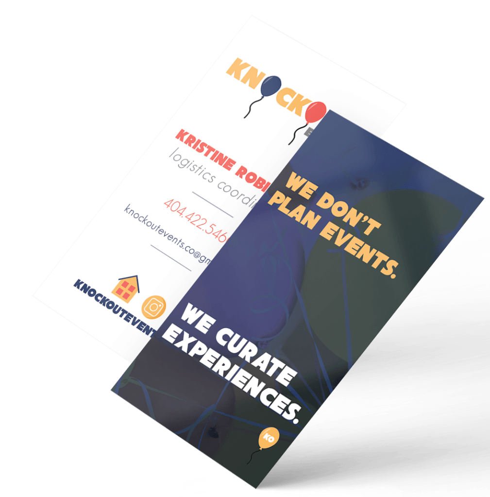
- Color Palette: Sticking to bright and fun, we chose a gold-ish yellow which conveys cheerfulness and optimism. A light red for excitement, and a deep blue for trust and dependability. It's important that the feelings of trust, excitement, and cheer are evoked in the event planning industry.
- Typography: With having graphic elements and 3 colors plus a neutral, I opted to play with composition and size rather than fonts. One font with different levels was sufficient.
- Elements: Hand drawn balloons tie up the family friendly "party" storyline, and also balance playfulness with the corporate feel of the overall design.
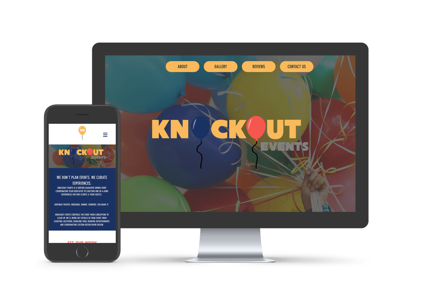
Knockout preferred a sleek one page that's easy to navigate. The goals for this site were:
VIEW FULL SITE HERE
- Allow potential clients to submit an event inquiry
- Provide previous clients the means to submit a review
- Showcase events with photo galleries for clients to see the work they do
- Add credibility

