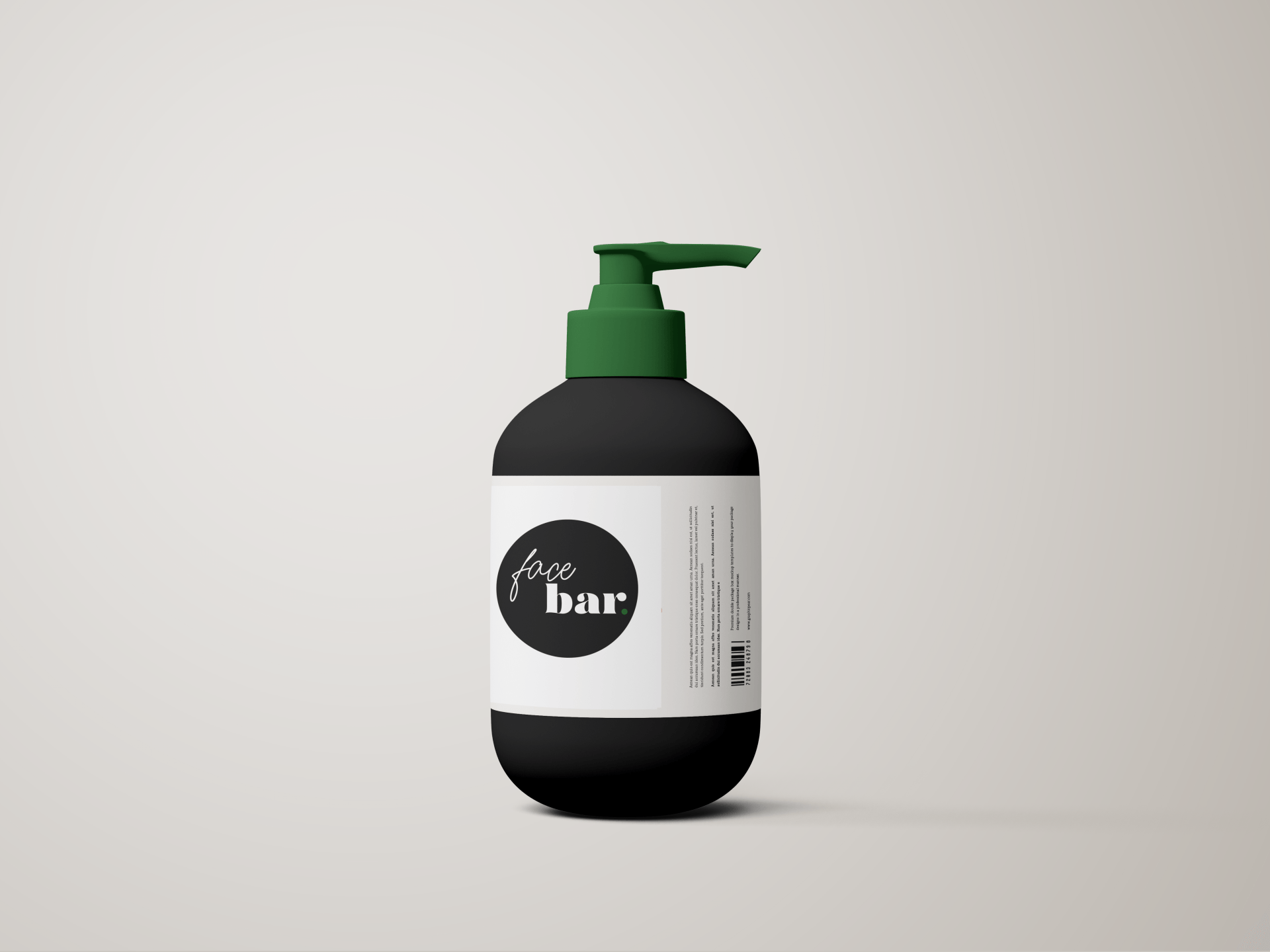
FACE BAR
BRAND IDENTITY
Face Bar is home to Atlanta based Esthetician, Brittany Thomas. Beginning with services such as lash extensions, Brittany branched out into skincare as a trained esthetician. Face Bar is a beauty studio providing skin care treatments, lash extensions, and take home treatments for clients to continue to care for their skin between appointments.
COLOR PALETTE
TYPOGRAPHY
SCOPE
Face Bar had no previous brand visuals, so the challenge presented was building a strong visual identity that was clean, sleek, and appealing to both men and women. My client was adamant about not wanting an identity that was so feminine it would alienate male clients. Respectively, being a female business owner, Brittany still wanted to preserve a touch of softness.
DESIGN
- Color Palette: We chose a deep Earth Green which communicates growth, tranquility, health, and peace. The deepness conveys maturity, in contrast to a bright green. To remain minimal we kept it neutral with Black and White.
- Typography: My client was firm in wanting fonts that convey both femininity and masculinity. We identified we wanted to communicate luxury, class, balance, cleanliness. I chose to mix a handwritten script font with a heavy serif font to encompass these desired characteristics.
- Elements: Though the period is the only element with color, it's intentionally designed to imply completeness, authority, and decision. This contrasts the playful "face" script.

